COPYWRITING AND VISUAL IDENTITY FOR GESA CREDIT UNION

THE
OBJECTIVES
2023
THE
CHALLENGES
THE
RESULTS
Client
Gesa Credit Union
Industy
Finance, Banking
Services
Copywriting, Visual Identity
Strengthen the Visual Identity and Maintain the Design Consistency
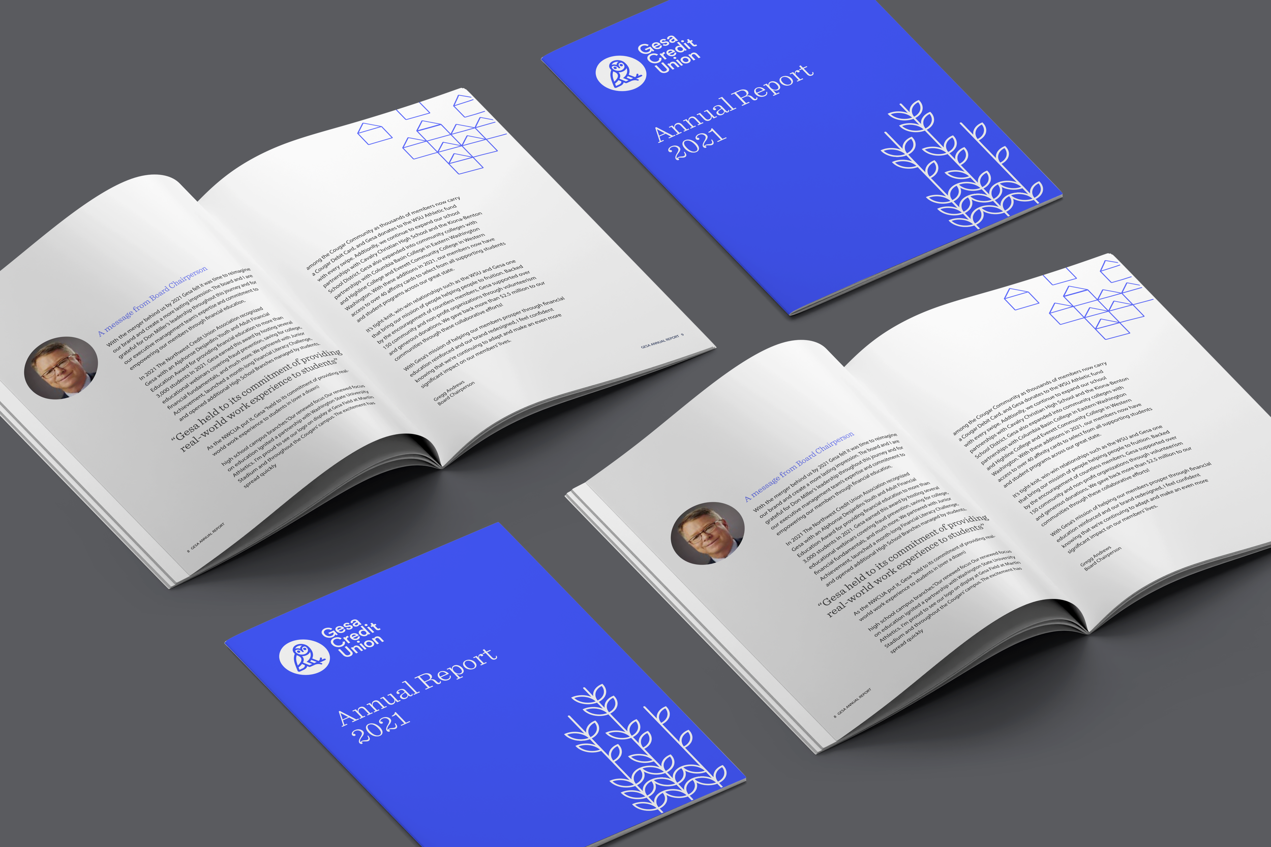
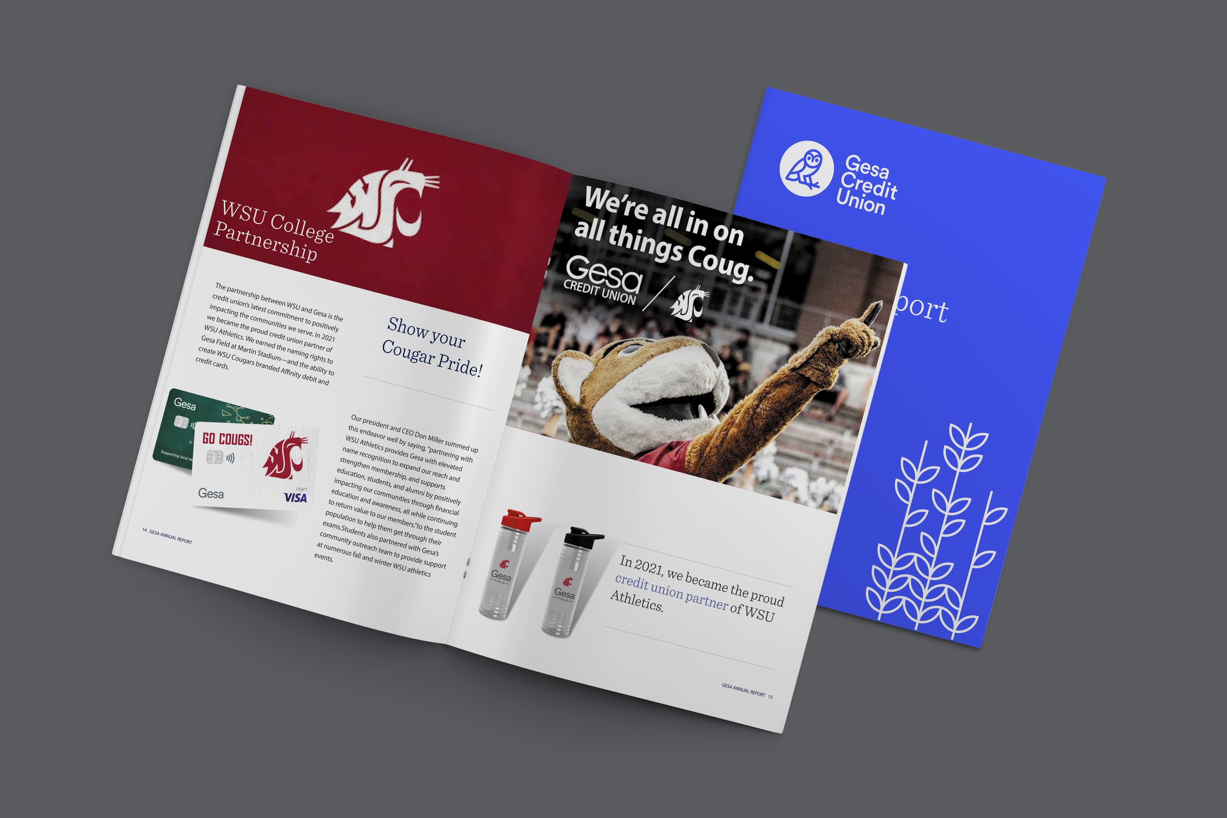
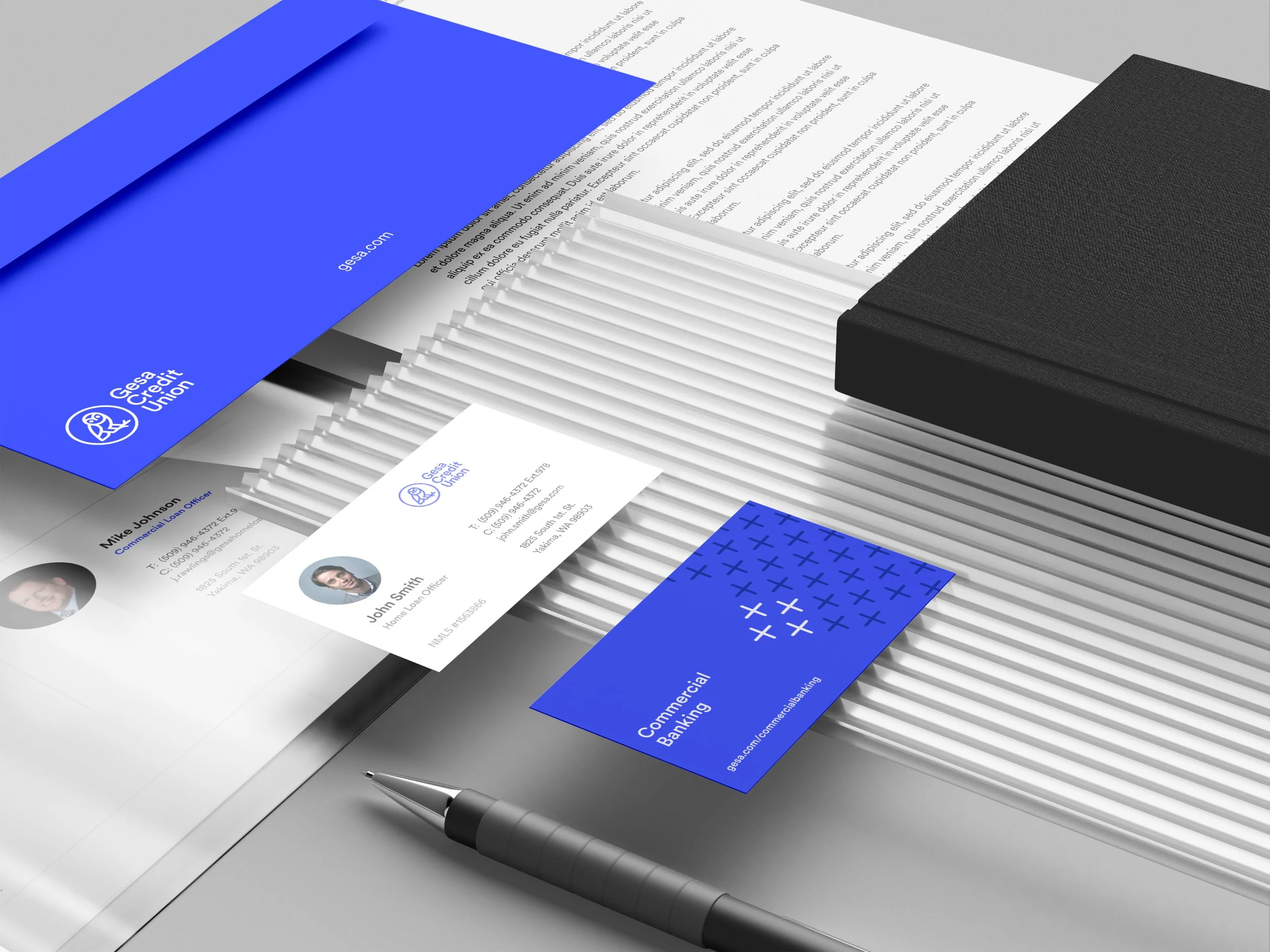
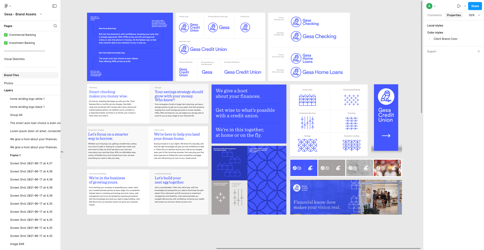
Develop a cohesive visual system that aligned with Gesa Credit Union’s established brand while giving the annual report its own polished editorial presence. Brand colors, typography, imagery, graphic elements, and layout conventions were used consistently to reinforce recognition, credibility, and trust.
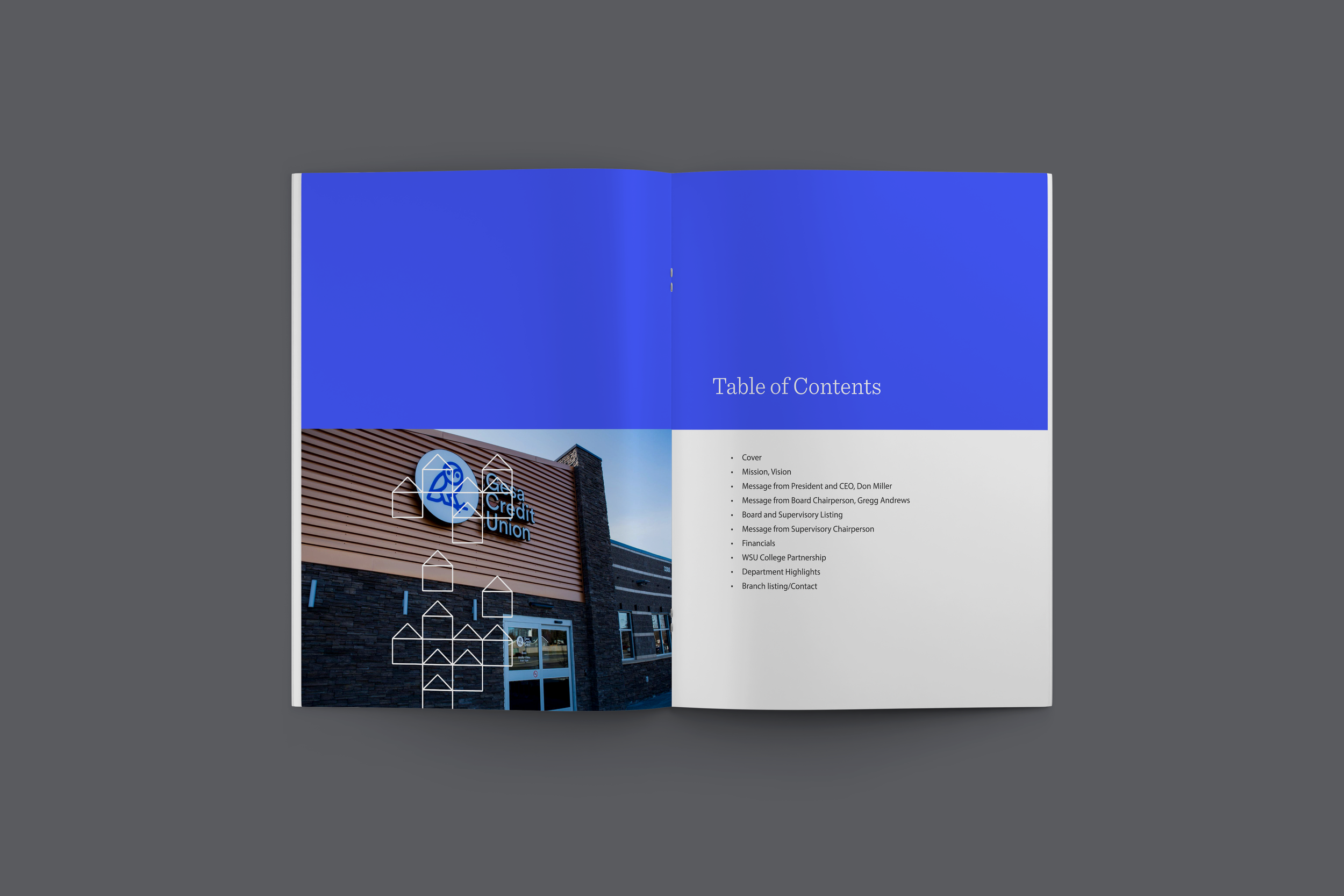
Build a repeatable editorial system that created continuity from page to page. Consistent typography, spacing, grids, data treatments, and visual elements helped ensure the report remained cohesive despite containing a wide variety of information.
Move beyond a purely financial document by incorporating storytelling throughout the report. Member experiences, organizational milestones, community impact, and success stories helped provide context for the numbers and demonstrate how Gesa’s work translated into meaningful outcomes.
Create a Stronger Narrative

Making the Financial Language Sound Approachable and Meaningful
One of the primary challenges was balancing the density and precision of an annual financial report with the need for an engaging reader experience. Financial statements, performance metrics, leadership messaging, community stories, and organizational highlights all required different levels of emphasis without making the report feel fragmented or overwhelming.
The copy also needed to speak to multiple audiences. Financial stakeholders required accuracy and clarity, while members and community readers needed approachable language and meaningful context. The challenge was to preserve the professionalism expected of a financial institution while making the information feel accessible rather than overly technical.
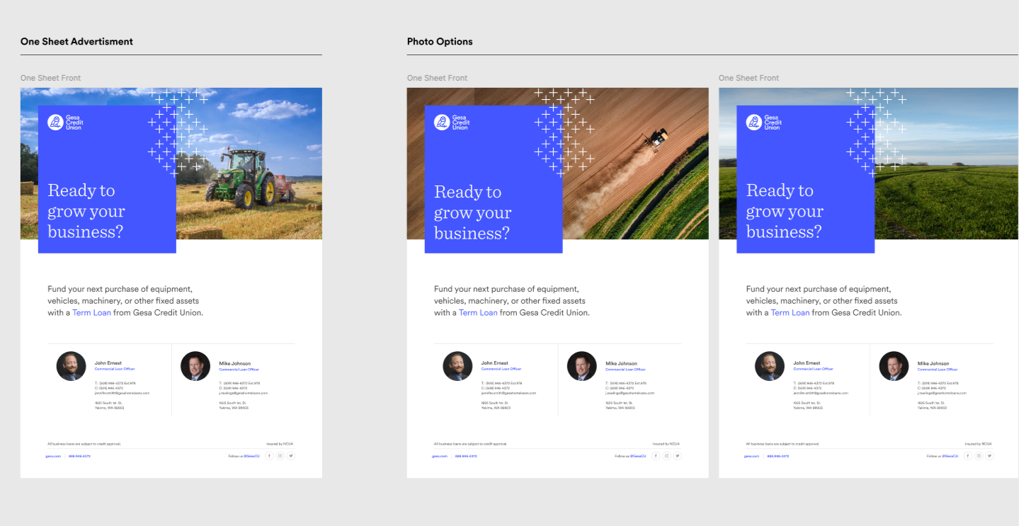
Visually, the project required translating an existing corporate identity into a flexible editorial system. Rather than simply applying brand elements to each page, the design needed enough variety to sustain interest throughout the report while maintaining a consistent and recognizable Gesa Credit Union presence.
Turning Features Into Benefits
The completed annual report presented Gesa Credit Union’s financial performance, accomplishments, and strategic priorities within a unified and professional visual system. The redesigned information hierarchy made complex content easier to scan and understand, while the combination of concise copy, financial data, imagery, and member-focused storytelling created a more engaging reading experience.
A consistent editorial framework strengthened the overall presentation of the Gesa Credit Union brand and gave the organization a polished communication piece capable of serving multiple audiences—from leadership and financial stakeholders to members and community partners.
Ultimately, the project transformed a data-heavy corporate report into a clear, credible, and human-centered brand experience—supporting Gesa Credit Union’s commitment to transparency, fiscal responsibility, innovation, and member satisfaction.